How to Customize Fonts, Buttons, and Form Fields on Your Dubsado Forms with Custom Code
Create a seamless, on-brand client experience with every detail perfectly styled.
Introduction: your forms, your brand
When you run a business doing what you love, every client touchpoint should reflect the care and professionalism you bring to your work. And your forms? They’re no exception.
Dubsado forms aren’t just functional—they’re part of the experience. Customizing fonts, buttons, and form fields allows you to create forms that feel like a natural extension of your brand. Sleek, cohesive, and uniquely you.
In our recent Dubsado Form Design Workshop Part 2: Coded Forms shared below, so many of you requested a blog with the code and details for how to customize your forms, that we knew we had to put this together for you!
In this guide, we’ll show you how to take your Dubsado forms from basic to branded with simple customizations that make a big impact—the Dubsado way.
Why customizing forms to be cohesive with your brand matters
Your brand is more than a logo or color palette. It’s how you make clients feel at every step. Customized forms:
Build trust: Consistent branding across forms shows professionalism.
Enhance user experience: Easy-to-read fonts, intuitive buttons, and clean form fields make interactions smoother.
Set you apart: Small design details create a premium experience, positioning you as the expert you are.
Beginner vs. advanced customizations: start simple or go big?
Start with the basics (most popular for beginners):
Fonts, buttons, and form fields are the most common starting points because they instantly transform the look and feel of your forms. These foundational customizations make your forms feel cohesive, professional, and reflective of your brand.
But if you’re ready to take things even further and add a wow factor, here are some more advanced options to explore:
Looking for advanced customizations?
Parallax effects: Create dynamic backgrounds that scroll at different speeds for a modern, interactive feel.
Enhanced headers & footers: Frame your forms with stunning design elements like video and advanced navigation functionality to elevate your brand.
Style proposal packages: Apply a cohesive design theme across your service packages for a premium experience.
Showcasing galleries & portfolios: Perfect for creatives wanting to display work right inside their proposals.
Sliding testimonials: Share client love with rotating testimonials that add credibility and crush objections.
Accordion blocks: Keep forms organized and user-friendly by letting clients expand sections as needed—perfect for frequently asked questions.
Staggered process timelines: Visually guide clients through your process with stylish, step-by-step timelines.
Conditional logic: Show or hide form content based on user responses for a tailored client experience.
👉 If these advanced features sound exciting but out of reach, don’t worry—there’s help available (keep reading for options!).
Don’t have time or want to learn how to customize code? We’ve got you covered.
We get it—between running your business, delivering client work, and managing daily tasks, deep-diving into form customizations may not make the top of your list. If you’re thinking, "This sounds amazing, but I just don’t have time or want to do this myself," here are options to help you get the customized look you want—without the time commitment:
Option 1: Certified Dubsado Specialist services or templates
Certified Specialists know the ins and outs of Dubsado and offer customizable templates or done-for-you form design services. They’ll help you create polished, branded forms while you focus on what you do best.
👉 Explore our Certified Specialist Directory and filter Services to Form Design or Form Template Purchase Options to find the right expert for you. Not all Certified Specialists use code, so be sure to review their services or reach out to inquire about their approach before booking.
Option 2: Third-party code generators and templates
If you’re comfortable with some DIY customization but need a shortcut, these platforms offer pre-built code snippets and full template solutions with step-by-step tutorials with no coding knowledge required.
Ready to DIY your custom fonts, buttons, and form fields in Dubsado? Let’s get started!
Before adding custom code, it’s helpful to create a test style guide form in your Form Templates area. This will allow you to preview how your fonts will look across different text styles and form elements—without affecting your live forms. After you are done with styling everything how you’d like, you can then copy and paste the code into your other forms.
How to set up a test style guide form
Go to your Dubsado account > Templates (side navigation) > Forms > create a new form (or duplicate an existing one).
Add a Text Box to the form and apply each paragraph formatting style:
H1 – Largest heading
H2 – Subheading
H3 – Section heading
H4 – Smaller heading
Normal (Body) – Standard text
Add all form elements (buttons, input fields, dropdowns, checkboxes, etc.) so you can see how stylings apply to each one.
Save the form and keep it open for reference as you apply your stylings.
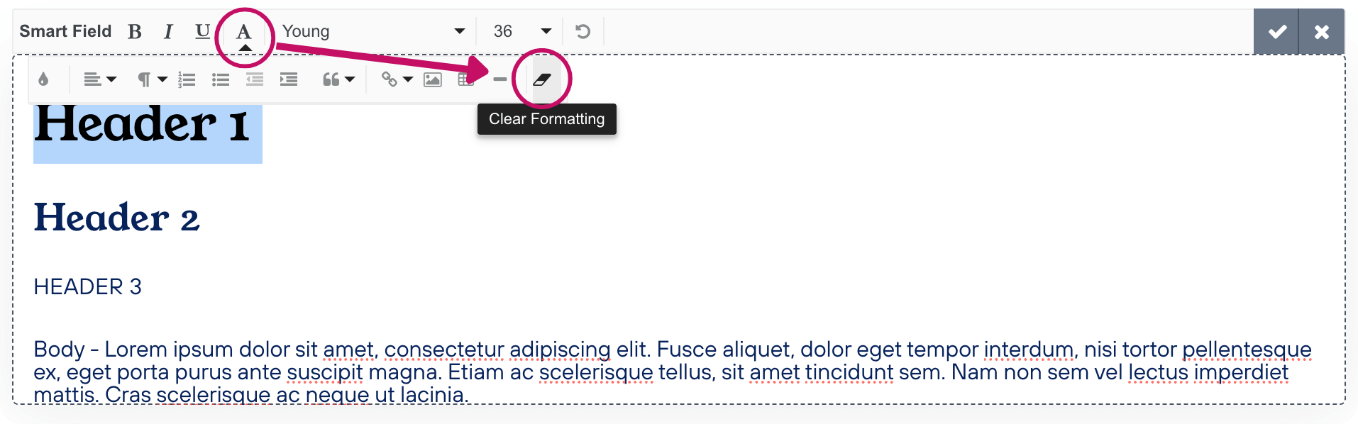
Note: If you’re adding custom fonts to a current or duplicated form, text formatting may have been manually adjusted. Formatting applied within text boxes can also override your CSS, so we recommend clearing the formatting from your text and then applying paragraph styles (Heading 1, Heading 2, etc.) as needed. There is an option to Clear All Formatting (eraser icon) in the text editor toolbar under Formatting options (A icon).
Access the custom code panel in your Dubsado form
Before we start importing fonts, we need to access the Custom CSS panel in Dubsado:
Open your form in Dubsado.
Click on the palette icon in the navigation bar to access Form Styling.
Select under Custom CSS > Edit CSS.
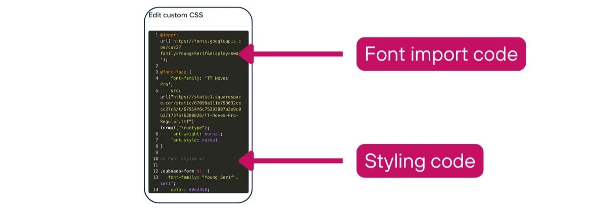
This is where you’ll add the code to import and apply your custom fonts and details needed might be slightly different depending on the source of the font. If you’re unsure of what kind of font you have, do a quick Google search to see where if connected to a certain host.
Import your branded font files into Dubsado
See the video below for a visual guide of how to complete the below instruction to import your fonts into Dubsado. Your fonts will go at the top of the Custom CSS Panel above any styling declarations.
Importing Google fonts into Dubsado
If you’re using Google Fonts, follow these simple steps:
Go to Google Fonts.
Search for your desired font.
Click on the font and select Get Font > Get Embed Code.
Under the Web tab, copy the @import code without the <style> tags.
Paste the @import code into your Dubsado form’s Custom CSS panel.
☝️ Make sure to add this font to the top of the CSS Panel.
Importing Adobe fonts into Dubsado
If you have Adobe Fonts, here’s what to do:
Go to Adobe Fonts.
Search for your desired font.
Click “Add font” for the font styles in your branding (e.g., thin, regular, italics).
Click "Add to Web Project" and create a web project name (e.g., Dubsado Forms).
Go to Manage Fonts > Web Projects to find your import link.
Copy the @import code without the <style> tags.
Paste the @import code into your Dubsado form’s Custom CSS panel.
Importing custom font files in Dubsado
If you have a custom font file (e.g., .ttf, .woff, .otf), you’ll need to host the file before using it in Dubsado. You have two options:
Option 1: Hosting fonts on your website
Upload your font file to your website’s media/assets library.
Locate the file URL (this is where your font is hosted).
Copy the URL and use it in your Dubsado form’s Custom CSS panel.
💡 If you’re unsure where to find the hosted font URL, inspect the page’s source code to locate the file path.
Option 2: Hosting fonts in Dubsado
If you’re having trouble with finding the source code on your website or don’t have a website to host your fonts, you can upload them directly to Dubsado. To do this, we’ll actually utilize a File Upload field on an existing questionnaire within any project. Feel free to do this in a test project, though any project will work!
Go to Projects > Forms > Create a new questionnaire.
Add a File Upload field.
Open the form.
Drag and drop your font file into the upload field.
Right-click the uploaded file and select Copy Link Address.
Paste the file URL into your Dubsado form’s Custom CSS panel.
Understanding CSS code structure & common styling properties
Before diving into styling your Dubsado forms, let’s break down the structure of CSS and some of the most commonly used properties. This will help you understand what you’re editing and how to customize it effectively.
Breaking down a CSS rule
A CSS rule consists of three key parts:
/* Comment: Describes what this section does */
.selector {
   property: value; /* This changes a specific aspect of the element */
}
1. Comments (/* ... */)
Anything inside /* ... */ is a comment—it won’t affect styling but helps keep your code organized. The example comment below tells us that the code below it applies to proposal tabs in your form.
/* Styling for proposal tabs */
.client-view-tabs {}
2. Selectors (.class-name {} or #id-name {})
Selectors target elements in your form that you want to style. The example below tells us that the code is targeting the client’s view of the proposal tabs.
Class selectors (
.class-name) → Apply to multiple elements.ID selectors (
#unique-id) → Apply to a specific element.
.client-view-tabs {  /* Targets the proposal tabs */
   background-color: #f8f8f8;
}
3. Properties & Values (property: value;)
Inside {}, you’ll add styling rules (properties) and define how they appear (values).
Breaking down this example:
.client-view-tabs → The selector (targets proposal tabs).
{ … }→ The curly braces contain all styling rules.
background-color: #f8f8f8; → Property (background-color) + Value (#f8f8f8).
font-size: 14px; → Changes text size inside the tabs.
padding: 10px; → Adds space inside the tab area.
.client-view-tabs {
   background-color: #f8f8f8; /* Background color of the tabs */
   font-size: 14px; /* Font size for text inside tabs */
   padding: 10px; /* Space inside the tabs */
}
Common styling properties & values
Now that you know how CSS is structured, here are some common properties you’ll be using when styling fonts, buttons, and form fields.
📌 Text styling
✅ font-family → Sets the font type.
Example: font-family: 'Lato', sans-serif;
✅ font-size → Adjusts text size.
Example: font-size: 16px; (Larger numbers = bigger text)
✅ font-weight → Controls text thickness.
400 → Normal
600 → Semi-bold
700 → Bold
✅ font-style → Adjusts text appearance.
normal → Standard text
italic → Italicized text
✅ text-transform → Controls capitalization.
none → Keeps text as typed
uppercase → ALL CAPS
lowercase → all lowercase
capitalize → Title Case
✅ letter-spacing → Adjusts space between letters.
0.02em; → Slight spacing
-0.05em; → Less spacing
✅ line-height → Controls space between lines.
1em; → Tight spacing
1.6em; → More spacing for readability
🎨 Background and borders
✅ background-color → Changes element background color.
Example: background-color: #f8f8f8;
✅ border & border-color → Adds an outline around elements.
Example: border: 1px solid #c40f65;
Use dashed or dotted for different styles.
✅ border-radius → Adjusts the roundness of corners.
0px; → Square
10px; → Slightly rounded
50px; → Fully rounded
✅ padding → Adds space inside an element (e.g., buttons).
padding: 20px 15px; → 20px top/bottom, 15px left/right
✅ margin → Adds space outside an element.
margin: 10px; → Adds spacing around the element
Putting these CSS properties into action
Below the font import codes you’ve already added in your Custom CSS panel, insert the following styling rules. This will define how each text element—like headings and paragraphs—should look in your form. You can customize font weight, color, size, and additional styling to match your brand’s aesthetic. If you don’t need to customize every styling option, feel free to remove any unnecessary lines from the code. On the flip side, you can use a site like W3 School’s CSS Reference Guide for more customization options!
Styling your custom fonts in Dubsado
Now that you’ve imported your fonts and understand how CSS works and which properties control styling, you’re ready to apply it to your forms! The next step is telling Dubsado where to apply them. Using CSS, you can specify which fonts should be used for different text styles, such as headings and body text, while also adjusting their appearance.
Below are some popular properties used in your form’s font styling and how to modify them:
Make sure to replace ‘FONT NAME’ with the actual fonts you’ve imported and check your font file to determine whether it’s a serif or sans-serif font to adjust where necessary. If your font is a sans-serif but the code specifies serif, change it to sans-serif (or vice versa) to ensure correct rendering.

/* Font styles */

.dubsado-form h1  {
   font-family: "Young Serif", serif;
    color: #0e2458;
    font-size: 36px;
    font-weight: 400;
    font-style: normal;
    letter-spacing: 0em;
    line-height: 1.6em;
    text-transform: none;
}

.dubsado-form h2  {
   font-family: "Young Serif", serif;
    color: #06235b;
    font-size: 26px;
    font-weight: 400;
    font-style: normal;
    letter-spacing: 0.02em;
    line-height: 1.4em;
    text-transform: none;
}

.dubsado-form h3 {
    font-family: 'TT Hoves Pro';
    color: #06235b;
    font-size: 16px;
    font-weight: 400;
    font-style: normal;
    letter-spacing: 0.02em;
    line-height: 1.2em;
    text-transform: uppercase;
}


.dubsado-form, .dubsado-form p {
    font-family: 'TT Hoves Pro';
    color: #06235b;
    font-size: 16px;
    font-weight: 400;
    font-style: normal;
    letter-spacing: 0em;
    line-height: 1em;
    text-transform: none;
}

b,
strong {
   font-weight: 600;
}

.text-editor ol, .text-editor ul, .text-editor li {
font-family: 'TT Hoves Pro';
font-size: 16px;
line-height: 1em;
}
Fallback fonts
Including fallback fonts ensures that if the primary font isn’t available, the browser will automatically switch to the next best option. This helps maintain a consistent look across different devices and browsers.
In the example below, the browser will first attempt to display "Lora". If that font isn’t available, it will try Georgia, then Times New Roman, and as a last resort, it will default to a generic serif font. Always choose fallback fonts that have a similar style to your primary font to keep the design as close to your original vision as possible!
.dubsado-form h1 {
   font-family: 'Lora', 'Georgia', 'Times New Roman', serif;
}
How to style your buttons
Buttons are more than functional—they encourage action. A well-designed button makes clicking feel effortless.
Default form button styling
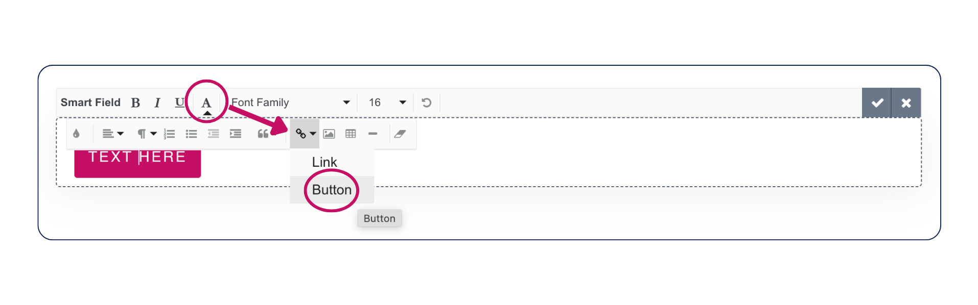
These are when you add a button in the text editor toolbar under Formatting options (A icon) > Insert Link or Button.
/* Style default buttons */
.form-viewer .dubsButton, .form-viewer .mcnButton {
  font-family: "Young Serif", serif;
    color: #ffffff !important;
    font-size: 13px;
    font-weight: normal;
    letter-spacing: 0em;
    line-height: 0em;
    text-transform: none;
    font-style: normal;
    background-color: #c40f65 !important;
    border-radius: 10px;
    border: 1px solid;
    border-color: #c40f65!important;
    padding: 20px 15px;
}

/* Style default buttons hover */
.form-viewer .dubsButton:hover, .form-viewer .mcnButton:hover {
    background-color: #c40f65 !important;
    color: #ffffff;
    border-color: #c40f65;
}
Submit button styling
This can be used across lead captures, proposals, and questionnaires.
Pro tip: Want to change the text to something else (e.g., ‘Let’s do this!’, ‘Accept proposal’)? You can head to the form navigation panel > select the palette icon to access Form Styling > change to your liking under ‘Submit button text’.
/* Submit button styling */
.submit-form-button {
   font-family: "Young Serif", serif;
    color: #ffffff !important;
    font-size: 13px;
    font-weight: normal;
    letter-spacing: 0em;
    line-height: 0em;
    text-transform: none;
    font-style: normal;
    background-color: #c40f65 !important;
    border-radius: 10px;
    border: 1px solid;
    border-color: #c40f65;
    padding: 20px 15px;
}

/* Submit button hover styling */
.submit-form-button:hover {
    background-color: #c40f65!important;
    color: #ffffff !important;
    border-color: #c40f65;
}
Proposal package select button styling
Other package elements can be found under the form fields section below.

/* Package button unselected */
.form-package-element .btn.btn-squared.border-around {
     font-family: "Young Serif", serif;
  color: #ffffff;
  background: #c40f65;
    text-transform: none;
    font-weight: normal;
    padding: 15px 25px;
    border-color:#c40f65;
    border-width:2px;
    border-radius:10px;
}

/* Package button unselected hover */
.form-package-element .packageNotSelected .btn.btn-squared.border-around:hover {
   background-color: #06235b!important;
   border-color:#06235b!important;
   color:white!important;
}

/* Package button selected */
.form-package-element .packageSelected .btn.btn-squared.border-around {
   background-color: #06235b!important;
   border-color:#06235b!important;
   color:white!important;
}
Questionnaire save draft button styling

/* Style questionnaire save draft button */
.save-draft-button {
    font-family: "Young Serif", serif;
    color: #ffffff !important;
    font-size: 13px;
    font-weight: normal;
    letter-spacing: 0em;
    line-height: 0em;
    text-transform: none;
    font-style: normal;
    background-color: #c40f65 !important;
    border-radius: 10px;
    border: 1px solid;
    border-color: #c40f65;
    padding: 20px 15px;
}

/* Style questionnaire save draft button hover */
.save-draft-button:hover:enabled {
    background-color: #c40f65 !important;
    color: #ffffff !important;
    border-color: #c40f65!important;
}
Download PDF button styling

/* Style download PDF button */
.pdf-button {
    background-color: #c40f65 !important;
    border-radius: 10px;
    border: 1px solid;
}
svg.svg-inline--fa.fa-download.fa-w-16 {
    color: #000000 !important;
}

/* Style download PDF button hover */
.pdf-button:hover {
    background-color: #c40f65 !important;
    border-color: #c40f65; /
}
.pdf-button:hover svg.svg-inline--fa.fa-download.fa-w-16 {
    color: #ffffff !important;
}
Back to Client Portal button styling
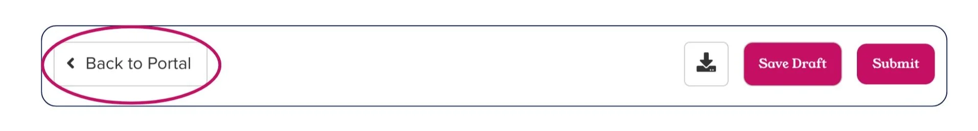
/* Style back to client portal button */
.back-to-portal-button {
    font-family: "Young Serif", serif;
    color: #000000 !important;
    font-size: 13px;
    font-weight: normal;
    letter-spacing: 0em;
    line-height: 0em;
    text-transform: none;
    font-style: normal;
    background-color: #c40f65 !important;
    border-radius: 10px;
    border: 1px solid;
    border-color: #c40f65;
    padding: 20px 15px;
}
/* STYLE CLIENT PORTAL BUTTON ON HOVER */
.back-to-portal-button:hover {
    background-color: #c40f65 !important;
    color: #ffffff;
    border-color: #c40f65;
}
How to style your form field elements
Form fields are where the magic happens—this is where clients share their information such as short and free form answer fields, checkboxes, multiple choice selections, dropdown fields, date selects, and file upload elements.
All form fields styling
/* All fields label text */

.form-element__input-label {
  font-family: 'TT Hoves Pro';
  color: #06235b;
  font-size: 16px;
  font-weight: 400;
  text-transform: none;
  letter-spacing: 0px;
}

/* All fields placeholder text */
.dubsado-form input::placeholder,
.dubsado-form textarea::placeholder,
.dubsado-form .select--placeholder {font-family: 'TT Hoves Pro';
  color: #a6a6a6;
  font-size: 16px;
  font-weight: 400;
  text-transform: none;
  letter-spacing: 0px;}

/* All input fields --- use !important */
.dubsado-form input, .dubsado-form textarea, .dubsado-form select {
  font-family: 'TT Hoves Pro';
  color:#0e2458;
  margin-bottom:10px;
  border-width: 1px 1px 1px 1px;
  border-radius: 10px;
  border-color: #06235b;
  box-shadow: none;
  background-color: #e9f7f0;
  height: 40px;
}

/*Required field asterisk */
.dubsado-form .required-field-indicator {
  color:#c40f65;
}

/* Required field border */
.form-viewer-element .has-error input,
.form-viewer-element .has-error textarea,
.form-viewer-element .has-error select {
border-color:#c40f65;
}

/* Required field error text */
.form-viewer-element .has-error .required-message {
  color:#c40f65;
  font-style: italic;
}
Short Answer field styling
If you are using the selectors for all fields above, you don't need to style these elements separately, unless you wish to make specific changes.

/* Short answer */
.form-element__input {

}
Free Response field styling
If you are using the selectors for all fields above, you don't need to style these elements separately, unless you wish to make specific changes.
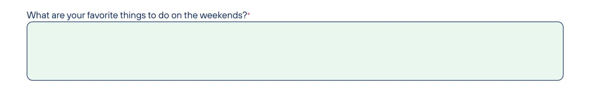
/* Free response */
.free-response-element__text-area {
    min-height:100px;
}
Dropdown field styling
When styling dropdowns, some styles may not be visible in the form builder. Preview the form or open it as a client to test your code. The dropdown element, workflow element, and project tracking element will all be selected.

/* Dropdown fields */
.dubsado-form select {
   margin-bottom:15px;
   border-width: 0px opx 2px 0px;
   border-color: #06235b;
   box-shadow: none;
   background-color: #e9f7f0;
   height: 40px;
}

/* Dropdown caret */
.form-element__select-container::after {
   color: #06235b;
}

/* Dropdown selected option text --- use !important for color */
.dubsado-form .form-element__select-container .select--selected-option {
}
Checkboxes field styling
These selectors are for the checkboxes element only. Please see the Proposal packages section below for package checkboxes and more.

/* Checkbox option label text */
.form-checkbox-element .checkbox-option label {
  font-weight: 400;
  text-transform: none;
  letter-spacing: 0px;
}

/* Checkbox unchecked */
.form-checkbox-element .checkmark {
  border-width: 1px 1px 1px 1px;
  border-color: #06235b;
  box-shadow: none;
  background-color: #e9f7f0;
}

/* Checkbox checked */
.form-checkbox-element .checkbox-option input:checked ~ .checkmark {
  background-color: #06235b;
  border-color: #06235b;
  color: #ffffff;}

/* Checkbox checked checkmark */
.form-checkbox-element .checkbox-option .checkmark:after {
  border-color: #ffffff;
}
Multiple Choice field styling

/* Multiple choice option label text */
.form-multiple-choice-element .radio-option label {
   font-weight: 400;
   text-transform: none;
   letter-spacing: 0px;
}

/* Multiple choice radio button unselected */
.form-multiple-choice-element .checkmark {
  border-width: 1px 1px 1px 1px;
  border-color: #06235b;
  background-color: #e9f7f0;
}

/* Multiple choice radio button unselected hover */
.form-multiple-choice-element .checkmark:hover {
  background-color: #e9f7f0;
  color: #ffffff;
  border-width: 0px 0px 0px 0px;

}

/* Multiple choice radio button selected */
.form-multiple-choice-element .radio-option input:checked ~ .checkmark {
  background-color: #06235b;
  border-width: 0px 0px 0px 0px;
}

/* Multiple choice radio button selected marker */
.form-multiple-choice-element .radio-option .checkmark:after {
  background-color:
  color: #ffffff;
}
Date Select field styling
The date select element has many components that can be styled. The appearance of the date select element also changes to include a time field when it is mapped to the project start or end date. You will need to use preview mode or open the form as a client to interact with the date select elements and test out your code.

/* Date select input fields --- use !important for borders */
.dubsado-form .date-input input {
  margin-bottom:10px;
  border-width: 1px 1px 1px 1px!important;
  border-color: #06235b!important;
  border-radius:10px;
  box-shadow: none;
  background-color: #e9f7f0;
  height: 40px!important;
}

/* Date select calendar button --- use !important */
.dubsado-form .date-input .icon-button__button {
  margin-bottom:10px;
  border-width: 1px 1px 1px 1px!important;
  border-color: #06235b!important;
  border-radius:10px!important;
  box-shadow: none;
  background-color: #06235b!important;
  height: 36px!important;
}

/* Date select calendar button icon --- use !important */
.dubsado-form .date-input .icon-button__icon {
  color: #ffffff!important;
}


/* Date select calendar */
.dubsado-form .rdtPicker {}

/* Date select calendar month and year */
.dubsado-form .rdtPicker th.rdtSwitch {
  color:#06235b;
  font-family: "Young Serif", serif;
}

/* Date select calendar month and year hover */
.dubsado-form .rdtPicker th.rdtSwitch:hover {}

/* Date select calendar arrows */
.dubsado-form .rdtPicker th.rdtPrev,
.dubsado-form .rdtPicker th.rdtNext {color:#06235b;}

/* Date select calendar arrows hover */
.dubsado-form .rdtPicker th.rdtPrev:hover,
.dubsado-form .rdtPicker th.rdtNext:hover {}


/* Date select calendar days of the week */
.dubsado-form .rdtPicker .dow {}

/* Date select calendar dates current month */
.dubsado-form .rdtPicker .rdtDay,
.dubsado-form .rdtPicker .rdtMonth,
.dubsado-form .rdtPicker .rdtYear {
}

/* Date select calendar dates previous and next month */
.dubsado-form .rdtPicker .rdtOld,
.dubsado-form .rdtPicker .rdtNew {}

/* Date select calendar current date */
.dubsado-form .rdtPicker .rdtToday {}

/* Date select calendar dates hover */
.dubsado-form .rdtPicker td.rdtDay:hover,
.dubsado-form .rdtPicker td.rdtMonth:hover,
.dubsado-form .rdtPicker td.rdtYear:hover {}

/* Date select calendar selected date */
.dubsado-form .rdtPicker td.rdtActive {
background-color:#e9f7f0;
  color: #06235b;
}


/* Time select input field --- use !important for borders */
.dubsado-form .time-select input {}

/* Time select dropdown menu */
.dubsado-form .time-select .time-select__menu {}

/* Time select dropdown menu hover */
.dubsado-form .time-select .time-select__menu .time-select__option:hover {}
File Uploader field styling
You will need to open the form as a client to interact with the file uploader and test out your code.

/* File uploader button */
.file-element__drop-zone .upload-btn {
margin-bottom:15px;
  border-width: 1px 1px 1px 1px;
     font-family: "Young Serif", serif;
  font-weight: 400;
  color: #ffffff;
  border-color: #06235b;
       box-shadow: none;
              background-color: #06235b;
       height: 40px!important;
  font-weight: 800;
       letter-spacing: 0px;
}

/* File uploader button hover */
.file-element__drop-zone .upload-btn:hover {}

/* File uploader text below button */
.file-element__drop-zone {
          font-family: 'TT Hoves Pro';
    color: #06235b;
    font-size: 16px;
    font-weight: 400;
  letter-spacing: 0px;}

/* File uploader drop zone (appears when a file is dragged to upload) */
.file-element__drop-zone.--dragging {}


/* Uploaded file list (appears when at least one file is uploaded) */
.file-element__file-list {}

/* Uploaded file list row */
.file-element__file-list .uploaded-file {}

/* Uploaded file list odd rows */
.uploaded-file:nth-child(odd) {}

/* Uploaded file list even rows */
.uploaded-file:nth-child(even) {}


/* Uploaded file preview image (image uploads only) */
.uploaded-file__file-preview img {}

/* Uploaded file preview icon (other file type uploads only) */
.uploaded-file__file-preview svg {}

/* Uploaded file name (download link) */
.uploaded-file__file-name {
     font-family: 'TT Hoves Pro';
    color: #06235b;
    font-size: 16px;
  font-weight: 400;
       text-transform: none;
       letter-spacing: 0px;
}


/* Uploaded file delete button */
.file-element__file-list .uploaded-file__delete-btn {
background-color:#06235b;
}

/* Uploading file cancel button (briefly visible during upload) */ .file-element__file-list .uploaded-file__cancel-btn {
background-color:#06235b;
}
Proposal navigation tabs
When a proposal is set to show a contract and/or an invoice, navigation tabs will appear at the top of the page. You’ll need to repeat these styles on your contract template, since the styling from the proposal will not carry over. The tabs disappear once the client reaches the invoice.

/* Proposal tabs area */
.client-view-tabs {}

/* Proposal tabs text */
.client-view-tabs-col-label {}

/* Proposal tabs underline --- use !important */
.client-view-tabs-col div {
   border: /*styles the underline below the tabs*/;
}
Proposal package elements

/* Package elements */
.form-package-element {}

/* Package item names and amounts table (generated by smart field) */
.form-package-element table {}

/* Package item names and amounts all table cells */
.form-package-element table thead td,
.form-package-element table tbody td {}

/* Package item names and amounts table header row */
.form-package-element table thead {}

/* Package item names and amounts odd rows */
.form-package-element table tbody tr:nth-child(odd) td {}

/* Package item names and amounts even rows */
.form-package-element table tbody tr:nth-child(even) td {}

/* Package item names and amounts table item name column */
.form-package-element table thead tr td:nth-child(1),
.form-package-element table tr td:nth-child(1) {}

/* Package item names and amounts table description column */
.form-package-element table thead tr td:nth-child(2),
.form-package-element table tr td:nth-child(2) {}

/* Package item names and amounts table description text */
.form-package-element table ul {}

/* Package item names and amounts table quantity column */
.form-package-element table thead tr td:nth-child(3),
.form-package-element table tr td:nth-child(3) {}

/* Package item names and amounts table tax column */
.form-package-element table thead tr td:nth-child(4),
.form-package-element table tr td:nth-child(4) {}

/* Package item names and amounts table subtotal column */
.form-package-element table thead tr td:nth-child(5),
.form-package-element table tr td:nth-child(5) {}

/* Package button unselected */
.form-package-element .packageNotSelected .btn.btn-squared.border-around {}

/* Package button unselected hover */
.form-package-element .packageNotSelected .btn.btn-squared.border-around:hover {}

/* Package button selected --- use !important and repeat any style changes you made to the unselected button */
.form-package-element .packageSelected .btn.btn-squared.border-around {}

/* Package quantity box unselected */
.form-package-element .packageNotSelected .packageQuantity {}

/* Package quantity box selected --- repeat unselected styles here if you don't want the box to change when a qty is entered */
.form-package-element .packageSelected .packageQuantity {}

/* Package large checkbox unselected */
.form-package-element .checkbox label.text-left::before {}

/* Package large checkbox selected */
.form-package-element .packageSelected .clip-check.check-info.check-brand-color label:before {}

/* Package large checkbox selected checkmark */
.form-package-element .packageSelected .clip-check label:after {
  color: ; /* checkmark color */
}

/* Package small checkbox unselected */
.form-package-element .roast label:before {}

/* Package small checkbox selected */
.form-package-element .packageSelected .roast label:before {}

/* Package small checkbox selected checkmark */
.form-package-element .packageSelected .roast label:after {
  color: ; /* checkmark color */
}
Contract and Subagreement signature and initial fields
Initials and signature area elements are only available on contracts and sub agreements.
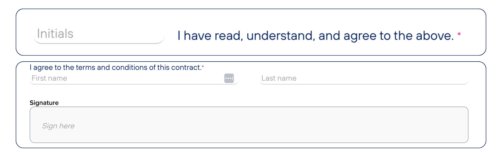
/* Initials element */
.initials-element {}

/* Initials input --- may require !important */
.initials-element__initials-input {}

/* Initials text */
.initials-element__text-label {}


/* Signature area element */
.signature-element {}

/* Signature area text */
.signature-element .form-element__input-label {}

/* Signature area first and last name fields --- may require !important */
.signature-element .signature-name-fields-name {}

/* Signature area first and last name fields placeholder */
.signature-element .signature-name-fields-name::placeholder {}

/* Signature field label */
.signature-input-label {}

/* Signature field --- may require !important */
.signature-element .signature-input-field {}

/* Signature field placeholder */
.signature-element .signature-input-field::placeholder {}

/* Signature information text */
.signature-element .signature-information {}
Troubleshooting common issues
Customizing forms is exciting, but sometimes things don’t look quite right. If that happens:
Double-check your code for typos and errors, especially when using punctuation marks like ; after values and stylings between brackets {}.
Make sure CSS selectors match the form elements.
Refresh your browser or clear the cache to see updates.
Sometimes an element might not be visible from within the Form Builder, but is when select the Preview button.
If all else fails, sometimes you may need to use !important
Need more guidance? Check out our Help Desk for detailed troubleshooting.
🛑 Heads up! Due to the complex nature of custom code, our Customer Care team isn’t able to provide support on forms with custom code. For assistance on a form with custom code, please ask our Facebook community, or reach out to a web developer or the creator of any code snippets and templates if using a third-party solution.
The Dubsado Way: Delivering a polished client experience
At Dubsado, we know running a business is an adventure—exciting, challenging, and totally worth it. Customizing your forms helps you enhance the professional and polished brand experience you want to deliver. Because when your forms are branded, intuitive, and beautiful, your clients notice and feel a connection to your brand at every touchpoint.
What’s next?
✨ Want more customization tips? Ask your questions in our Facebook Community to get support and inspiration from other users.
💬 Proud of your customized form? Share it on social channels and tag us so we can reshare to inspire others with your design.
Because at the end of the day, running a business is about more than just processes—it’s about showing up as the confident, creative entrepreneur you are. And with Dubsado, you’re always ready to put your best foot forward.