Getting Started with Email Marketing
Our friends at Flodesk are taking over our blog today with their favorite email marketing tips and tricks. (affiliate link gets you 50% off Flodesk!)
So excited that you’re ready to build your list! Did you know businesses that use email marketing are forty times more effective at acquiring new customers?
We love email marketing because it’s a safe bet. Unlike cultivating followers, with email marketing there’s no risk in losing your audience because you own every email. There’s no fighting new changes to algorithms that show your content to only a portion of your audience.
And the best part? Email marketing converts at least six times better than any other channel out there, so if you’re looking to ramp up your business goals, you’re making the right moves.
SWIPE COPY—WHAT TO SAY IN THOSE FIRST EMAILS?
First things first, let’s talk about content. Whether you’ve been collecting emails for a while or are just getting started with friends and family as your recipients, a solid welcome can set the tone for what they can expect from you and jumpstart your list’s engagement.
Here’s swipe copy for our top three favorite ways to welcome new subscribers to your list—a personal note, extending an offer, and sharing freebie content. Keep in mind that the more you customize the copy to your brand, voice, and tone, the better your audience will respond. We recommend using these as a starting point.
→ Personally welcome new subscribers to your list
Hey friend!
I’m so excited to welcome you to the list. Our journey is only beginning, and now you are a part of it. I’m overwhelmed with gratitude to have you here.
A little bit about me—I started [enter your business name] because [enter your why]. Over the coming weeks, you can expect to hear all about [enter the type of content you’ll be sharing].
If you have ideas, feedback or requests in the meantime, reply to me to let me know! I’d love to hear from you.
Warmly,
[Your name]
→ Share an offer as a thank you for subscribing (with reminder)
Hi there!
They say business isn't personal, but it's personal to me. Every time someone joins my list, I notice. Truly, you made my day when you signed up for my newsletter. I wanted to give you a little something to make your day, too.
Here’s a code good for [your offer] your first [your product] from [enter your business name]. Use code [YOUR CODE] to get started.
You made my day when you signed up for the newsletter. I wanted to give you a little something to make your day, too. ❤️
Enjoy!
[Your name]
→ Offer reminder
Hey friend!
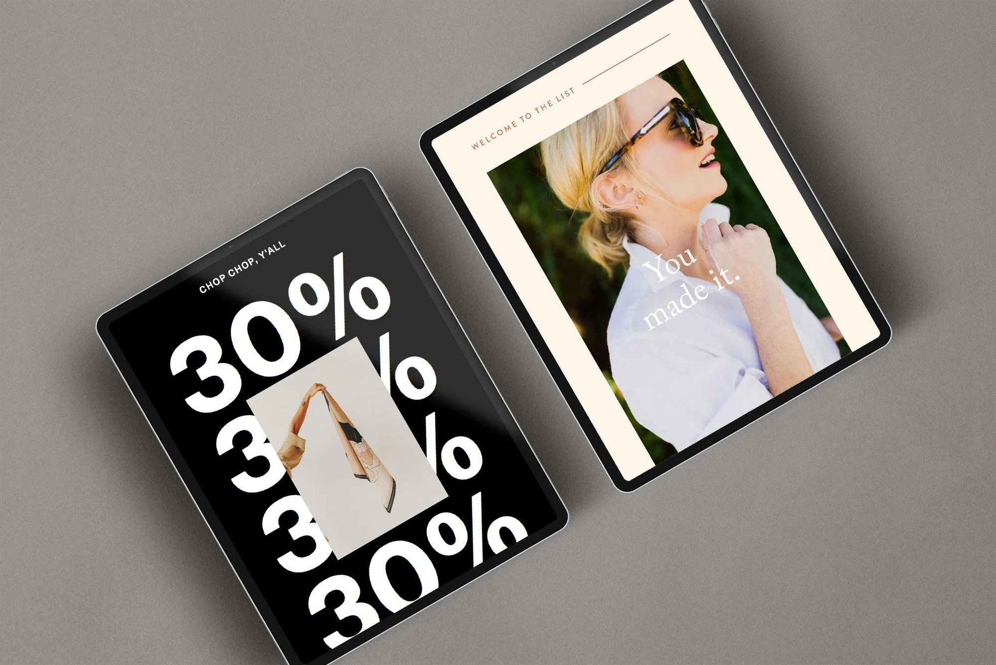
Remember that [offer description, for example “25% off code”] I sent ya for joining the list? Well, it’s about to expire and I would hate to see it go to waste! There’s only one thing you have to do...hop to the site before it's over!
Yes, that's right, friend! You have just until this evening to get [code] [your product]. Enter code [YOUR CODE] to grab this awesome deal!
→ Send new subscribers freebie content when they subscribe
Note: this type of welcome requires you to set up a lead magnet ahead of time. A lead magnet is a piece of free content, usually a PDF, that you offer your new subscribers in exchange for their email. To create a lead magnet, you’ll want to first create a form that you either embed on your website or publish to the web to collect subscriber emails). Then, you can create an automation to send the below welcome email every time a new subscriber enters their email. Don’t forget to attach your PDF or piece of free content to your email!
Hey friend!
I wanted to pop in to get you that [content you offered when they signed up] delivered straight to your inbox.
Aaaand now for the fun part (drumroll please!). It's all right here. Just click the button below to grab it and dive in!
[Insert link or button]
Warmly,
[Your name]
Writing subject lines that boost your open rates 👀
Once you have your content ready, you’ll want to craft a subject line that drives subscribers to open your emails. Here are our top tips for standing out in the inbox:
1. Keep your subject line under 40 characters long to avoid cropping
2. Capitalize only the first word (or don’t add any caps if it’s on brand for you!)
3. Add an emoji to stand out (but avoid using lots of exclamation points or CAPITALIZING entire words, it doesn’t look good!!!!)
4. Use action words when possible. For example, say “open this now to see what you missed” instead of “here’s a summary of what you missed”.
5. Add urgency by using phrases like “last chance”, “hurry and save your spot” or “ending soon”. Contrary to popular fear, being direct is great for conversion.
6. But avoid using words like “urgent” or “free” that can be picked up by spam filters.
7. Use first names to personalize your content, for example: “Rebecca, I’m excited to share this with you”
Design hacks to optimize your email for conversion
Having great design not only gives your emails that wow factor, but it is also proven to increase your conversion. In most cases, you’ll want to guide your subscribers to your CTA, or call-to-action—whether that is a link, a button, or an invitation to reply to you.
→ Keep it short
Keeping your content short also makes it easier to see the overall structure and hierarchy of the email, not to mention, keeps the call to action above the fold (above the edge of the screen, before they have to scroll down to continue seeing your content).
→ Add spacing
The secret ingredient in designing emails that look professional and beautiful—lots of space. We recommend putting a 20 to 40 pixel spacer between sections in your email to add a light and airy feel to your design.
→ Optimize your CTA
Stick to action items and short words. A button that says “Buy now” or “Click here” is going to convert much better than a button that says “Click here to buy it now”. Longer buttons also tend to wrap on mobile devices, making your button look broken.
→ Make it accessible
A big factor for email design is color. Keep in mind that not everyone can perceive color in the same way. Avoid using light fonts on light backgrounds and dark fonts on dark backgrounds to make your email accessible and inclusive.
→ Send a test
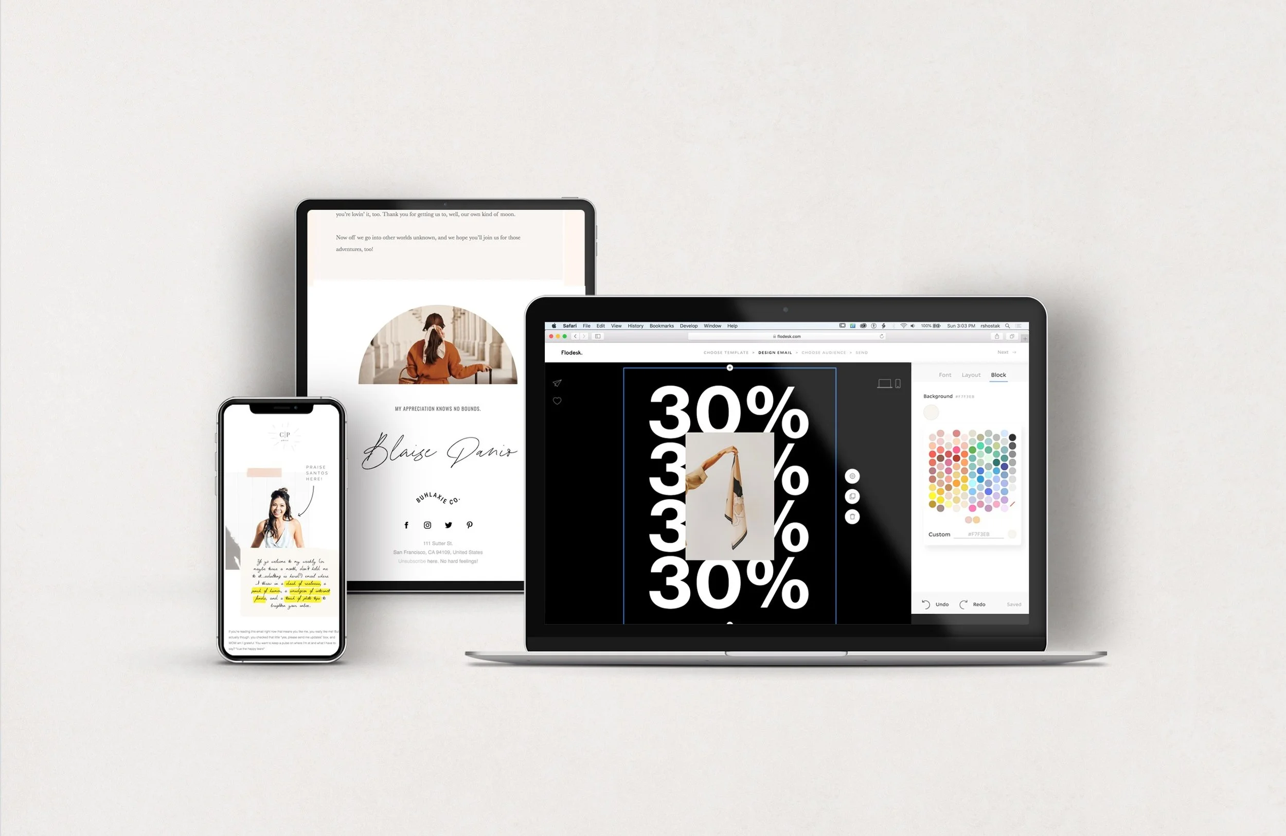
The best way to make sure your email is flawless? Send yourself a test and review your email before it goes live. Open your email using different devices to make sure it looks great on both desktop and mobile.


